top of page
I N T R O D U C I N G

A concept mobile app allowing users to find their ideal cafe and reserve a table in advance.

B U S I N E S S C H A L L E N G E
There's been a 5.5% reduction in cafe foot traffic from January 2020 to June 2022 leading to a decrease in revenue.
R O L E S
UX Researcher
Product Designer
S O L U T I O N
A mobile app that allows users to reserve a table at a cafe or coffee shop in advance based on factors such as the food selection, atmosphere, WiFi, and table/outlet availability.
S K I L L S
User Research
Product Design
Design Systems
UI Design
T H E P R O C E S S
Understanding user requirements
Wireframing
& prototyping
Usability study
Iterations
Applying visual elements to the wireframes
Finalizing the user the user flow & prototype
U N D E R S T A N D I N G U S E R R E Q U I R E M E N T S
User Interviews
To understand common challenges that cafe customers face, I conducted interviews involving 5 participants ranging from the ages of 18-27 who were either food influencers or frequent cafe visitors. Participants expressed that they have trouble finding cafes with decent WiFi along with table and outlet availability.
In order to capture the participant's frustrations and goals I created a persona. I then used the persona to create a problem statement to summarize common customer pain points.
Understanding the User
P R O B L E M S T A T E M E N T
Busy cafe visitors including students and remote workers struggle to quickly find a cafe with good seating, outlets, and WiFi allowing them to work efficiently and attend meetings with minimal interruptions.
This helped me identify user requirements the solution should address.
Reduce the amount of time it takes to find a cafe.
Users should be able to find a cafe with their ideal cafe activity level.
Cafe must have available seating, outlets, and decent WiFi.
U N D E R S T A N D I N G T H E U S E R ' S P R O C E S S
User Journey Map
To help identify potential solutions and common user pain points, I created a journey map drafting out the process a user takes to find their ideal cafe. In addition to this, I identified potential improvement opportunities to help create the solution.

After identifying the improvement opportunities for each step, I came up with the solution.
S O L U T I O N
P E R S O N A

Serena Sullivan
"I wish there were more cafes that had everything that you needed cause I’ve been spending a lot of time on many occasions trying to find a place to work and it’s very frustrating.”
GOAL
Go to cafes mainly to do work and for the environment
FRUSTRATIONS
Finding cafes with enough seating, outlets, and decent WiFi
Selena is a 21-year-old female who is a student in her final year at UC Berkeley majoring in Finance. She is also part of the finance committee at her school. Recently, she finished an internship in New York. Due to her work-heavy schedule, Selena used to visit cafes frequently to study and work as they have a lively, yet productive environment. However, she has stopped going to cafes recently as it is difficult to find cafes with enough seating, outlets, or decent WiFi.
Age: 21
Education: UC Berkeley
Hometown: San Jose, CA
Family: 1 sister, 1 brother, mother,
father
Occupation: Finance
A mobile app allowing users to reserve a table at a cafe or coffee shop in advance based on factors such as the atmosphere, WiFi, and table/outlet availability.
W I R E F R A M I N G & P R O T O T Y P I N G
Low-Fidelity Wireframes
To start creating the solution, I first drafted out the wireframes by manually sketching them. After, I converted them into digital wireframes (Below shows only the wireframes of the main flow).
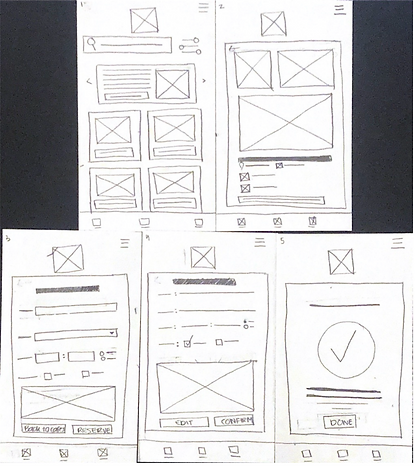
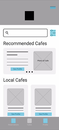
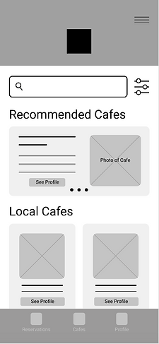
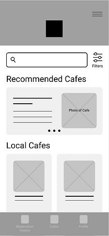
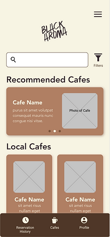
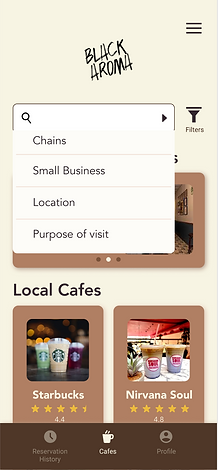
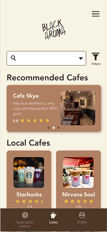
Home Page
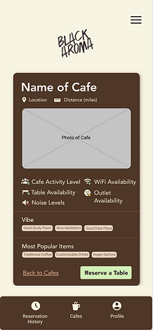
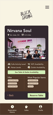
Cafe Profile
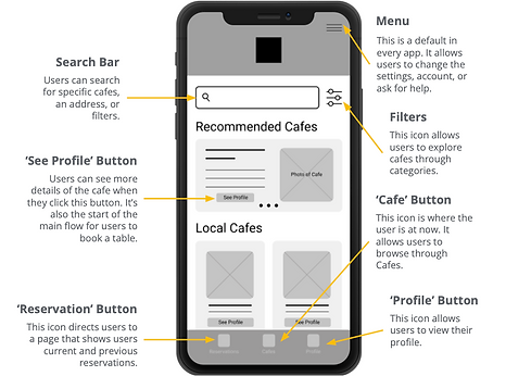
When users first open the app, the home page opens. The home page provides a selection of cafes that are most applicable to the user through the recommended cafes section and also shows cafes that are closes to the user. There is also an option to search for a cafe through the search bar or applying specific filters.
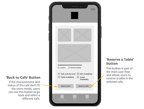
The cafe profile gives information to the user about how busy the cafe is, location, connectivity, or how far it is. It also allows users to choose a different cafe or reserve a table.
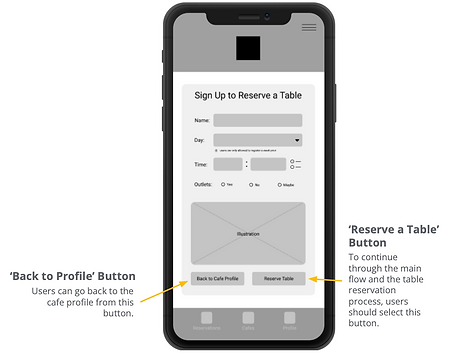
Register to Reserve a Table
This is the third wireframe in the main flow. To reserve a table, users must register.
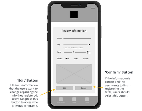
Review Information
In this wireframe, users can confirm that they registered the right information before finishing the reservation process.
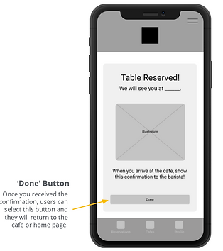
Reservation Confirmation
This interface confirms that the table is reserved and is the last wireframe of the main flow.
Low-Fidelity Prototype
The image shows all the wireframes connected together to make a low-fidelity prototype. The video shows how the low-fidelity prototype would appear when a user interacts with the low-fidelity prototype.


U S A B I L I T Y S T U D Y
Findings
After creating the low-fidelity prototype, I conducted a usability test to understand how intuitive my design is.
Users struggle to access the cafe profile.
Users want more cues to understand the reservations tab.
Users want more information about the cafe such as the food selection.
Users struggle to identify the purpose of certain icons.
I T E R A T I O N S
Iterated Low-Fidelity Wireframes
Based on the usability study findings, I made changes to the low-fidelity wireframes.
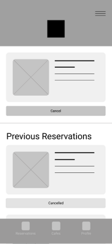
Users had difficulty accessing the profile as the CTA button is too small. To make action more intuitive and accessible, I removed the see profile button and made the card clickable.
Users had difficulty understanding why the reservation section is divided into two parts. I added a label to indicate that the top section shows recent reservations and changed the reservations tab label to reservations history.

Users want more information about the cafe such as the food selection and the cafe vibe. So I added sections to show the best sellers and vibe of the cafe.


Lastly, users wanted a way to confirm their reservation cancellation for instances where they accidentally click the cancellation or they accidentally click the button. To do this, I added a pop-up box to confirm whether they want to cancel their reservation or not.

A P P L Y I N G V I S U A L E L E M E N T S T O T H E W I R E F R A M E S
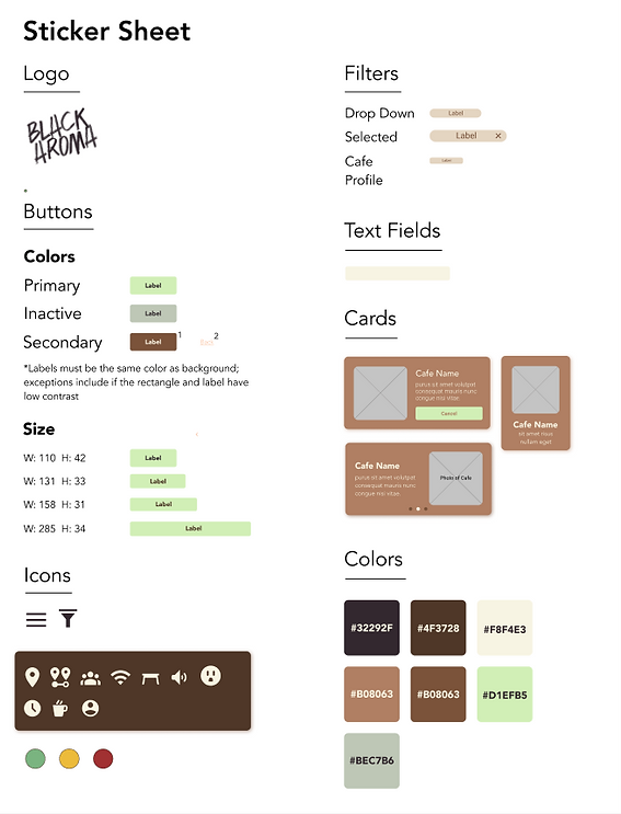
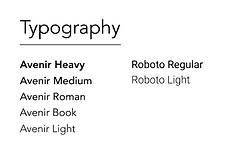
The Design System
After finalizing the basic layout for Black Aroma through the low-fidelity prototype, I started curating the high-fidelity prototype by developing the design system. The sticker sheet below shows the app's visual elements ranging from the fonts and colors to the size of each button or card.
High-Fidelity Wireframes & Prototype
To curate the high-fidelity prototype, I applied the design system to Black Aroma's interface. Below shows how I applied the visual elements to the main flow.


U S A B I L I T Y S T U D Y
Findings
To see how effective the visual elements facilitate the user experience of Black Aroma and test the changes of the high-fidelity prototype, I conducted another usability study. Below are the insights I gathered from the study.
Most users instantly went to the search bar instead of the filters to look for a certain type of cafe.
Users were curious to see which tables were available.
Users were unsure on how to reserve a table for a group of people.
I T E R A T I O N S
Iterated High-Fidelity Wireframes
Based on the usability study findings, I made changes to the high-fidelity wireframes.
As users used the search bar more often than the filters to find certain cafes, I added suggestions to the search bar.

Since users want to see which tables in the cafe are available, I added a button in the cafe profile section which leads the user to another interface showing which tables and outlets are available.


Lastly, I added an option for users to add the number of guests that will be visiting the cafe and another option allowing users to select which table they want to reserve.

F I N A L I Z I N G T H E U S E R F L O W A N D P R O T O T Y P E
Final User Flow
Below shows the final user flow I landed on after making all the iterations based on the low-fidelity, high-fidelity usability study insights, and implementing the design system.

Users first browse through a selection of cafes based on their location and preferences, then selects a cafe where they want to reserve a table. For now, let's pretend the user wants to reserve a table at Nirvana Soul.
After, the user looks through the cafe profile to determine if this cafe fits their needs. To do this, the user selects the
'See Table & Outlet Availability' button to see which tables and outlets are available.
After, the user browses the available tables and outlets and decides to sit on the main floor.
The user goes back to the cafe profile and selects 'Reserve Table' to move to the next step.
The user then fills out a form with their desired preferences. This involves indicating when and where the user wants a reservation, if they want outlets, and the number of guests they plan to bring.
Before completing the table reservation process, the user is given a chance to review their information. After the user is happy with the information they provided, they press 'Reserve Table' to complete the table reservation process.


Voilà, the user has reserved a table at Nirvana Soul!
See the Final Prototype

I M P L E M E N T I N G V I S U A L C U E S
Accessibility
To make Black Aroma easily accessible, I integrated several visual cues improving the user experience of the app.
Contrast
I used different opacities for icons in the menu bar to assist users in understanding which page they're on.
To make the call-to-action (CTA) button easy to locate, I created high contrast between the background and button.
Labels
As some of my study participants use visual aids in their daily life, I used icons to indicate aspects of the interface. I also labelled the icons to direct users to the appropriate page.
Container Boxes
I used container boxes to group information pertaining to one topic together. For instance, if the user looks at the interface with the selection of cafes, they will notice that each cafe has it's own box. In that box is information pertaining to that cafe.
Transitions
I used transitions to indicate the next steps in the user's flow. For instance, when the user is proceeding to the next step when reserving a table the screen swipes to the left indicating that part of the process is done, revealing the next step in the process.
W H A T I L E A R N E D
Takeaways
Designing this app taught me how extensive the thought process of user experience design can be ranging from successfully meeting the users need, designing each screen, and understanding the flow of the whole app.
Most importantly, I learned how important of a role users play in designing the app. Apps are designed to make user's lives more efficient, therefore a user's honest feedback is extremely crucial when designing an app.
A F T E R T H E D E S I G N P R O C E S S
Next Steps
Below shows the next steps after the design process.
Determine the Implementation Strategy
Identify how cafe's and coffee shops will integrate Black Aroma with their current systems.
Design to Dev Handoff
Handover the final wireframes and prototype to development and work with them to develop the app, while ensuring that design and technical requirements align.
Launch the App
Determine the deployment strategy and launch the app.
bottom of page