top of page

A UX Designer with an analytical mind.
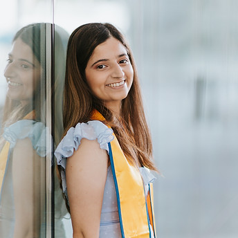
Pallavi Khanna
I graduated from San Jose State University with a degree in business analytics and work at IBM as an User Experience Consultant. Apart from business analytics and consulting, I am also interested in user experience design. To learn more about me, see how I developed my brand!
LOGO
To start the branding process, I first designed the logo.
Logo: Inspiration
INSPIRATION
In order to determine the style of my logo, I referenced different logo designs from influential designers.
Out of the designs I looked at, Ramin Nasibov's stood out to me the most. Here some of my favorite:


Brands I look up to in terms of their overall style guide


From this, I found that I prefer minimalistic logos that are designed based on a play of their typography or the brand's physical attributes.
To practice and understand these design styles, while developing my own style, I participated in a 30-day design challenge. These are some of the designs I enjoyed the most:
Landscaping

Photography Studio

Winery

Campground

Doggy Day Care

Community Theatre Group

IDEATION

P
This part of the logo represents the first letter in my first name.

K
This part of the logo represents the first letter in my last name. The K is backwards in the logo.

Icon
Since I am into
UX/UI design and have an interest in tech, I wanted my logo to look more like an icon. For this reason, I chose to add a circle in the background.

Logo
After combining all the elements this is the final version of my logo.
To make this part of the logo I played with the typography of the letters P and K. I used the triangular part of K and combined the hump in P.
COLOR PALETTE & BRAND PERSONALITY
After, I used color psychology to create my color palette and brand personality.
Anchor 1
RESEARCH & INTERVIEWS
Since colors play a big part in communicating feelings, I used color psychology to define my brand personality. To do this, I asked several individuals in my life what color I remind them of and why.

TRISHA
Relation: Friend through mutuals & social media
Color: Pink
Reasoning: "A bubbly and happy person"
TALHA
Relation: Friend through dance team & university
Color: Lavender
Reasoning: "Super dope"

KRYSSEL
Relation: Friend through ux design club
Color: Sea-foam Green
Reasoning: "Shy at first, but also very lively"

ANVAY
Relation: Close university friend; have a similar
personality & style
Color: Yellow
Reasoning: Not provided

SWATI
Relation: University & high school friend; similar
demographics
Color: Warm colors - pink, orange, yellow
Reasoning: Not provided

ASHWITA
Relation: Close dance team & ux design friend
Color: Pink
Reasoning: "Super sweet and caring"

KHUSHI
Relation: Family friend
Color: Green
Reasoning: "Can't necessarily explain it - just the vibes."

LEAH

Relation: Dance team friend
Color: Yellow
Reasoning: Not provided
In order for my brand to fully represent me, it is important to demonstrate how I see myself as well. To do this, I completed a similar questionnaire.
Color: Purple Black
Reasoning: Even though I can appear happy on the outside, I still have dark days. Getting through these dark days is what makes me happy and optimistic. In addition, I prefer a minimalistic style.

I also looked at the color psychology for each of the colors.
PINK
Individuals associated with the color pink are very loving, kind, and sensitive.
GREEN
The color green is associated with a calm, inventive, and analytical personality.
LAVENDER
Individuals associated with the color lavender are very harmonious and compassionate.
Individuals whose personality is associated with the color yellow are very charismatic and passionate.
YELLOW
ORANGE
Individuals associated with the color orange are very friendly and good-natured.
PURPLE BLACK
The dark purple color is associated with a very tranquil and peaceful personality.
COLOR PALETTE
Below is the color palette I derived after interviewing my network and learning about color psychology. To choose the exact color shades, I used coolors.co.
FECDE2
ORCHID PINK
MACARONI AND CHESSE
F7C08D
Fun Fact: My favorite comfort food is Macaroni and Cheese.
BBF2D6
MAGIC MINT
LAVENDER BLUE
LAVENDER BLUE
D3C8F9
DEEP CHAMPAGNE
FDD387
BLACK
COFFEE
32292F
Fun Fact: I enjoy my coffee black.
GRADIENTS
In addition to the colors, I created gradients to make my logo/brand resemble UX/UI design elements. Since the two most popular colors I got after interviewing my network was pink and yellow, the primary gradient is orchid pink to deep champagne.

BBF2D6
MAGIC MINT
FECDE2
ORCHID PINK

ORCHID PINK
FECDE2
DEEP CHAMPAGNE
FDD387

ORCHID PINK
FECDE2
LAVENDER BLUE
D3C8F9

BBF2D6
MAGIC MINT
LAVENDER BLUE
D3C8F9
LOGO ITERATIONS
Below are logo iterations from the gradients I made above.


This is the main logo since the primary gradient is pink to yellow.

BRAND PERSONALITY
Below are words that describe my brand personality based on the insights from my network and my brief research on color psychology.
Sensitive
Analytical
Charismatic
Harmonious
Lively
One of the personality traits that resonates most with me is being analytical. This is because I have a background in Business Analytics.
Design & Analytics
DESIGN & ANALYTICS
In this section, I will explain how my expertise in analytics contributes to being a UX Designer.
DATA VISUALIZATION IN THE 5-STEP DESIGN PROCESS
See how I used the 5-step design process to develop data dashboards and solutions to Santa Clara's Housing Crisis.
INFOGRAPHICS
Infographics is a visual image or chart that shows data. It is a common visual component in websites and apps, overlapping with user experience design. Below are three infographics I developed.

This infographic shows the best place to live in terms of three different categories - professional life, happiness levels, and outdoor activities.
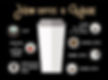
This infographic shows what steps it takes to make coffee from planting the seed to brewing the coffee.
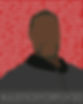
This infographic was made in response to the George Floyd tragedy. Behind George Floyd are the names of African American individuals that have suffered from police brutality.
bottom of page